September 26, 2026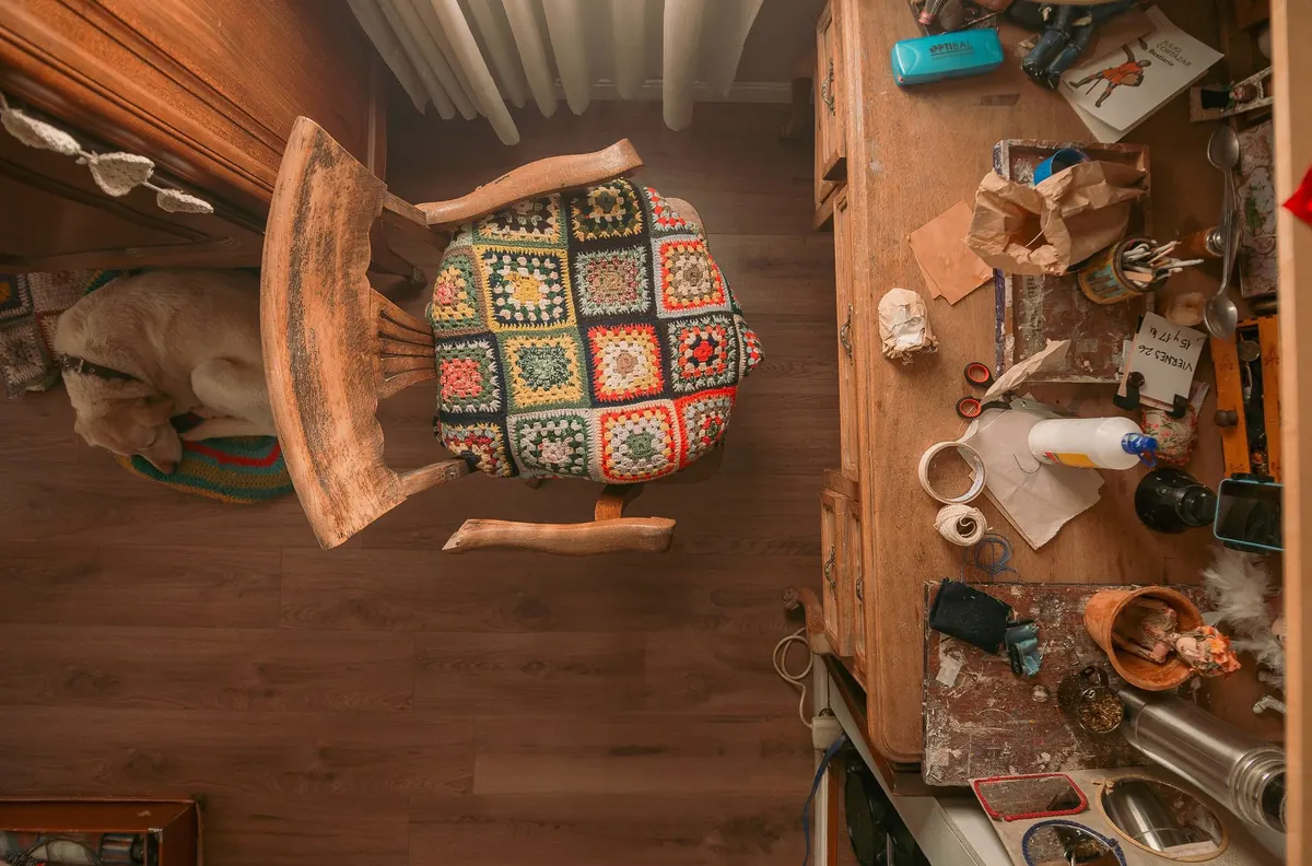
You can buy furniture you love, paint the walls a color you're sure about, and still walk into the living room and feel that something is off. Usually it isn't the sofa. It's a handful of small decisions — a rug that stops short of the seating, a lamp that never gets switched on, a shelf that has quietly become a storage unit. The encouraging part is that most of these mistakes cost nothing to correct. Here are the seven we see most often, and what to do instead.
1. Relying on One Harsh Overhead Light
A single ceiling fixture makes a room visible; it rarely makes it feel good. Light from directly above flattens everything, creates glare in the exact spot where you sit, and leaves corners in shadow. The result is a room that looks fine in photos and uncomfortable after dark.
Instead, build three layers:
- Ambient: the ceiling fixture on a dimmer, or a floor lamp aimed at the wall for a soft wash of light.
- Task: a table lamp beside the sofa and one beside your reading chair.
- Accent: a small lamp on a console, a picture light over art, or a candle-height light on a side table.
Choose warm bulbs, around 2700K, and keep the overall level lower than you think you need in the evening. Put lamps within reach of a seated person, and plug them into dimmers or smart plugs so you can drop the light after dinner instead of shutting the room down.
2. Choosing a Rug That's Too Small
Rugs are where people underspend and undersize at the same time. The most useful rule: at least the front legs of every main piece of seating should sit on the rug. If only the coffee table touches it, the rug reads as a mat floating in the middle of the floor and makes the whole seating area feel unstable.
In a typical living room with a sofa and two chairs, an 8x10 is usually the starting point. A 5x8 can work in a small apartment, but only if the seating group is genuinely compact.
Test the size before you buy. Lay painter's tape on the floor in the shape of the rug you're considering and leave it there for a day. Walk the path from the doorway to your usual seat — that route should stay on the rug, not skirt around it.
3. Pushing Every Piece of Furniture Against the Walls
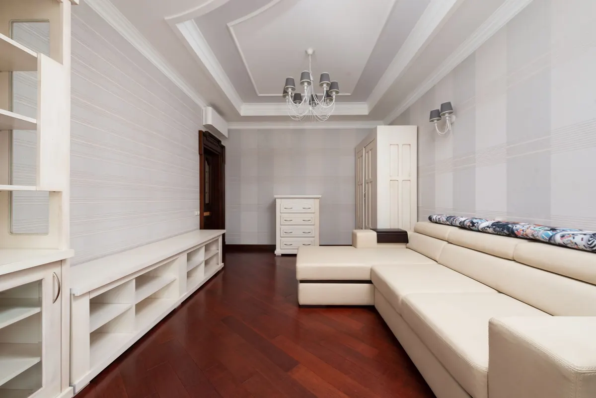
When furniture lines the perimeter, the middle of the room becomes a highway and conversation happens across a gap of eight feet. Pull the sofa forward, even 10 or 12 inches, and anchor it with a console table behind it if the back is exposed. Float the chairs opposite rather than beside it.
Leave roughly 16 to 18 inches between the coffee table and the sofa — enough to walk through, close enough to set down a cup without leaning. The goal is a grouping you could circle in a few steps. Rooms feel larger when the furniture is arranged with intent, not smaller.
4. Letting Shelves and Surfaces Fill Up
Clutter rarely arrives all at once. It accumulates one object at a time until the eye has nowhere to rest, and then even good pieces look like noise. The fix is an edit, not a shopping trip.
- Take everything off the shelf or table and put it on the floor.
- Return only the pieces you would genuinely notice missing.
- Group objects in odd numbers — three, or five — rather than pairs.
- Vary height: one tall vase, one medium bowl, one low stack.
- Leave empty space. Roughly a third of the shelf should stay bare.
- Stack a few books horizontally and set a small object on top.
On coffee tables and side tables, use a tray. It gives loose remotes, candles and glasses a defined home and makes tidying a ten-second job. If a surface hasn't been cleared in a month, it's holding storage, not decor.
5. Hanging Art Too High — and Too Small
Art hung near the ceiling looks like it's trying to escape. The general guide is to center a piece at about 57 to 60 inches from the floor, which puts the midpoint near eye level. Over a sofa, leave 6 to 10 inches of wall between the top of the sofa back and the bottom of the frame.
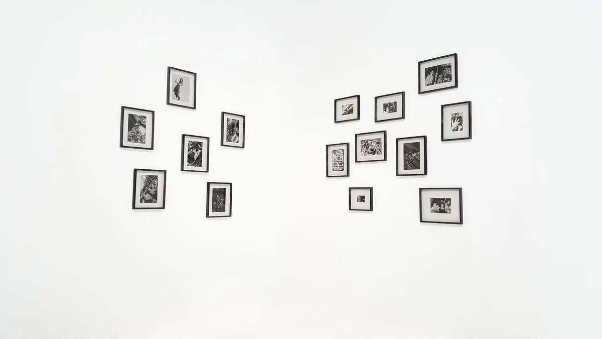
Scale matters just as much as height. A single piece above a sofa should span roughly two-thirds of the sofa's width; anything smaller looks lost. In a gallery wall, keep 2 to 3 inches between frames so the group reads as one composition rather than scattered stamps.
6. Curtains That Are Too Short and Too Narrow
Short curtains chop a wall into pieces and make ceilings feel lower than they are. Mount the rod close to the ceiling — or at least a few inches above the window frame — and let the panels run to the floor, just kissing it or grazing it by a half inch.
Width is the second half of the problem. Curtains need fabric to look like curtains. A common approach is total panel width of about one and a half to two times the window width, so the panels still have folds when they're closed. Buy two panels where you'd instinctively buy one, and hang the rod wider than the window so the glass is fully exposed when the curtains are open.
7. Furnishing the Whole Room in One Trip
Buying a matching sofa, loveseat, coffee table and end tables from the same collection is quick, and it's also why some rooms feel like showroom displays. A room reads as collected when materials and eras mix a little: a tailored sofa with a weathered wood side table, a glass lamp next to a woven chair, something old beside something new.
If you're starting fresh, buy the two pieces you'll use most and live with them for a month. Notice where you actually put your drink, where you wish there were a light, and how much floor space you really have. Then fill the gaps. Measuring first — doorway widths, wall lengths, the distance from sofa to fireplace — saves more money than any sale.
Where to Start
Don't redo the whole room this weekend. Fix one thing and live with it, because the changes compound. A sensible order:
- Clear the flat surfaces and take one bag of clutter out of the room.
- Add a second and third light source, and dim the overhead.
- Pull the sofa off the wall and check the coffee table distance.
- Lower the art, then raise the curtain rod.
- Save the rug for last, once you know the final footprint of the seating.
Most of these fixes take an afternoon and cost nothing at all. The room you already have is usually closer to finished than it looks.
Photo: Natalia Olivera / Pexels